Specter
Website design for startup data tool. In collaboration with Endless..
Introduction
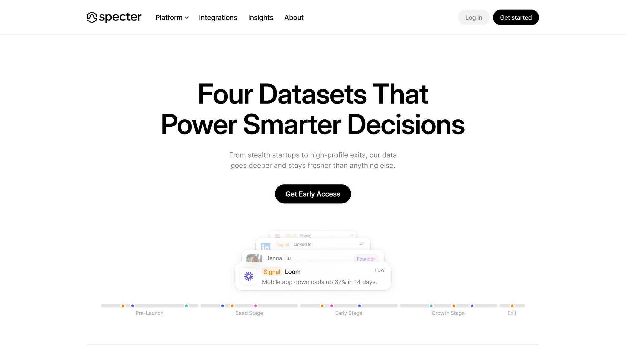
Specter is a data tracking platform that gives product teams visibility into their users' behaviour across every touchpoint. It surfaces insights that most analytics tools miss, with a focus on actionable data over raw metrics.
Web Design
7 weeks
TL;DR
Problem
Specter tracks things competitors can't, but the product's breadth made it hard to explain. Without a clear visual narrative, visitors left before understanding the value. The site needed to do the job of a sales demo.
Solution
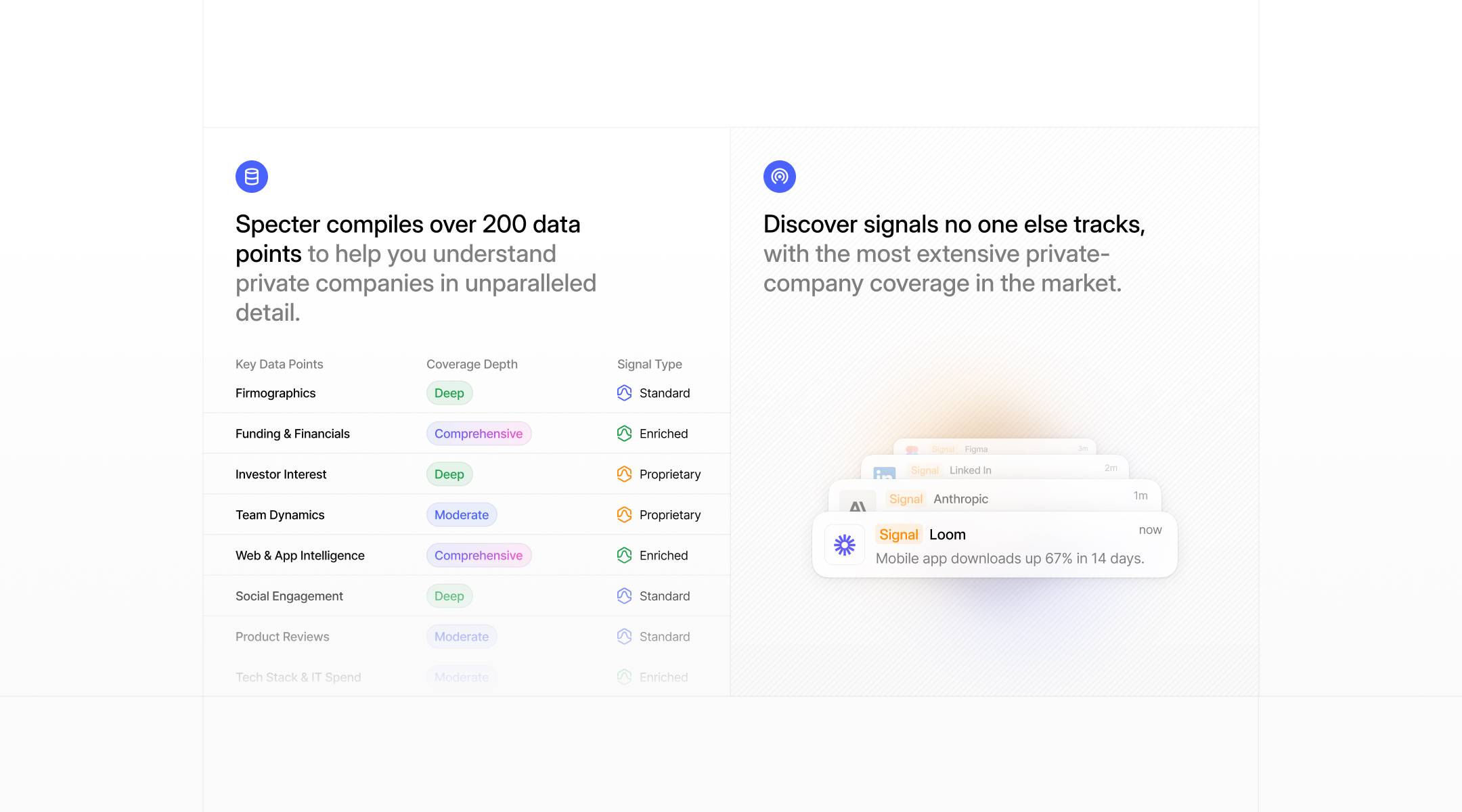
Unified visual language across the site — one system, not a stack of feature pages. Custom illustrations made the tracking mechanisms legible at a glance.
- Built a unified visual language across all feature pages — one system, not a stack of modules
- Used custom illustrations to make tracking mechanisms legible without screenshots
- Prioritised the 'what does this mean for me' question over feature depth on every page
- Created a narrative arc: problem surface → Specter sees it → here's what you do with it
Preview
What the work looked like
User Research
Three distinct audience groups, same core tension — the existing experience wasn't built for how they actually work.
01
Product Managers
- Need visibility into user behaviour across every touchpoint
- Want actionable insights, not raw metric exports
- Compare tools based on how fast they can surface answers
02
Growth Engineers
- Building funnels and attribution models
- Need tracking that captures what standard tools miss
- Judge platforms by how quickly they can get to production
03
Startup Founders
- Wearing multiple hats across product and growth
- Need a single source of truth without a data team
- Evaluate tools by whether the site explains it without a demo
Problem Statement
How might we make Specter's tracking depth legible to visitors in under 30 seconds — without a demo, without jargon?
Specter's website needed a way to communicate complex tracking capabilities with clarity.
With unified visual language and custom illustrations made the tool easier to understand, helping users quickly grasp what Specter does and how it works. This alone supported higher conversion across key pages.
Core Flows
Unified visual language across the site — one system, not a stack of feature pages. Custom illustrations made the tracking mechanisms legible at a glance.
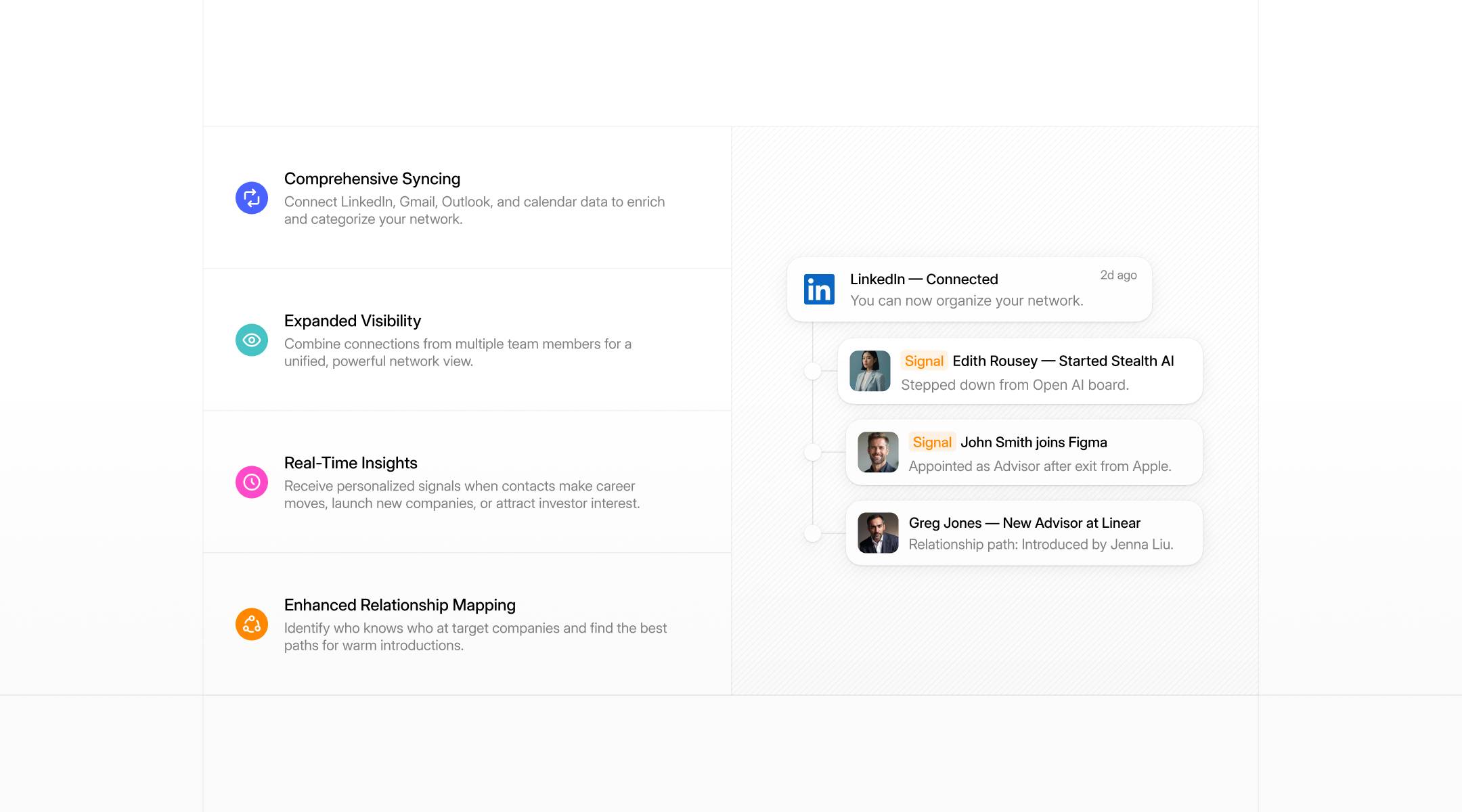
With unified visual language and custom illustrations made the tool easier to understand, helping users quickly grasp what Specter does and how it works. This alone supported higher conversion across key pages.

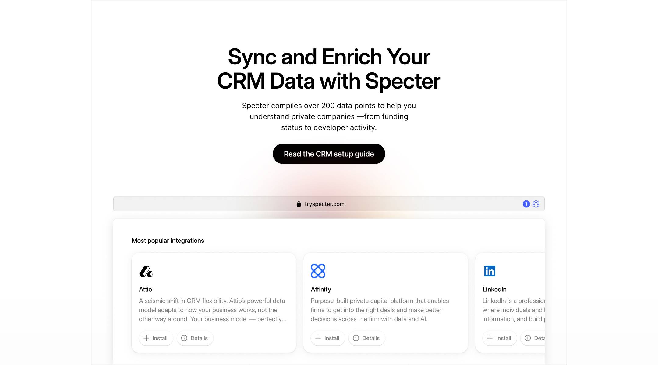
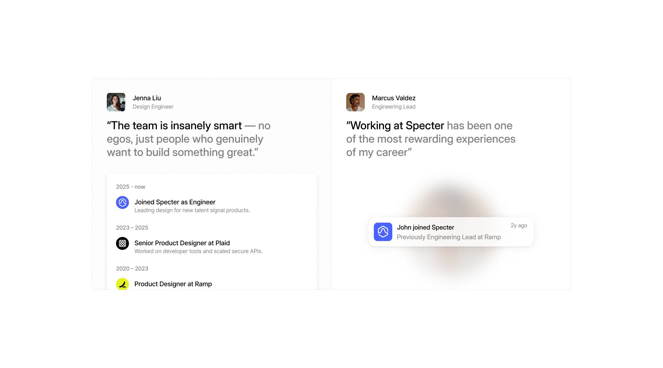
Brand Identity
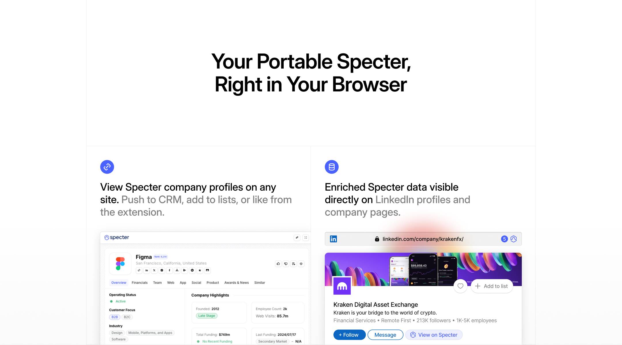
The site had to replace the sales demo. I built a unified visual system across every feature page — one illustration style, one layout grammar, one narrative arc. The design doesn't describe features; it walks visitors through the problem they already have.
Impact
7wk
Design to ship
↑
Key page conversion
↓
Sales cycle length
Higher conversion across key pages. The clarity of the site gave the sales team a better starting point for every conversation.
Key Learnings
01
Complexity isn't the same as depth
The most technical products often benefit most from the most careful simplification.
02
A unified visual language isn't a nice-to-have — it's what makes a multi-feature product feel like one coherent thing.
03
The site that does the demo's job for free is the most valuable sales asset a startup can have.